Leon M.
no paint by numbers shit
Hey! My name is Leon.
I’m a technical Motion Designer with a focus on creative problem solving and analytical thinking.
This site contains a collection of my works and experiments.
Feel free to check it out and get in touch with me!
(yes I check my) Mail
(and now I’m back on) Instagram
© Leon Monschauer - 2023
MotionGraphicsDesigner3DModellerVRDevlopementAnimatorLog
Here are some stills and videos of my work.
The name originates from my trouble of always trying out new things and not really knowing who I am as an artist.
I often experiment on a topic and the result gets buried on my drives. To prevent the burying, I’d just dump some stuff here for you.
There are also some payed projects sprinkled in. Maybe this will be the place where you can find everything I’ve ever created. We will see.
210713_01_Logo_Binary.png
I built a binary converter, which is able to transfer normal binary numbers into artworks. Can you guess what this one says? Hint: It’s also my Logo.
![]()
210207_01_Photoscan_Tests.jpg
When I got my hands on a LIDAR scanner, surely I needed to try it out. This is my buddy Jan scanned and rendered.
![]()
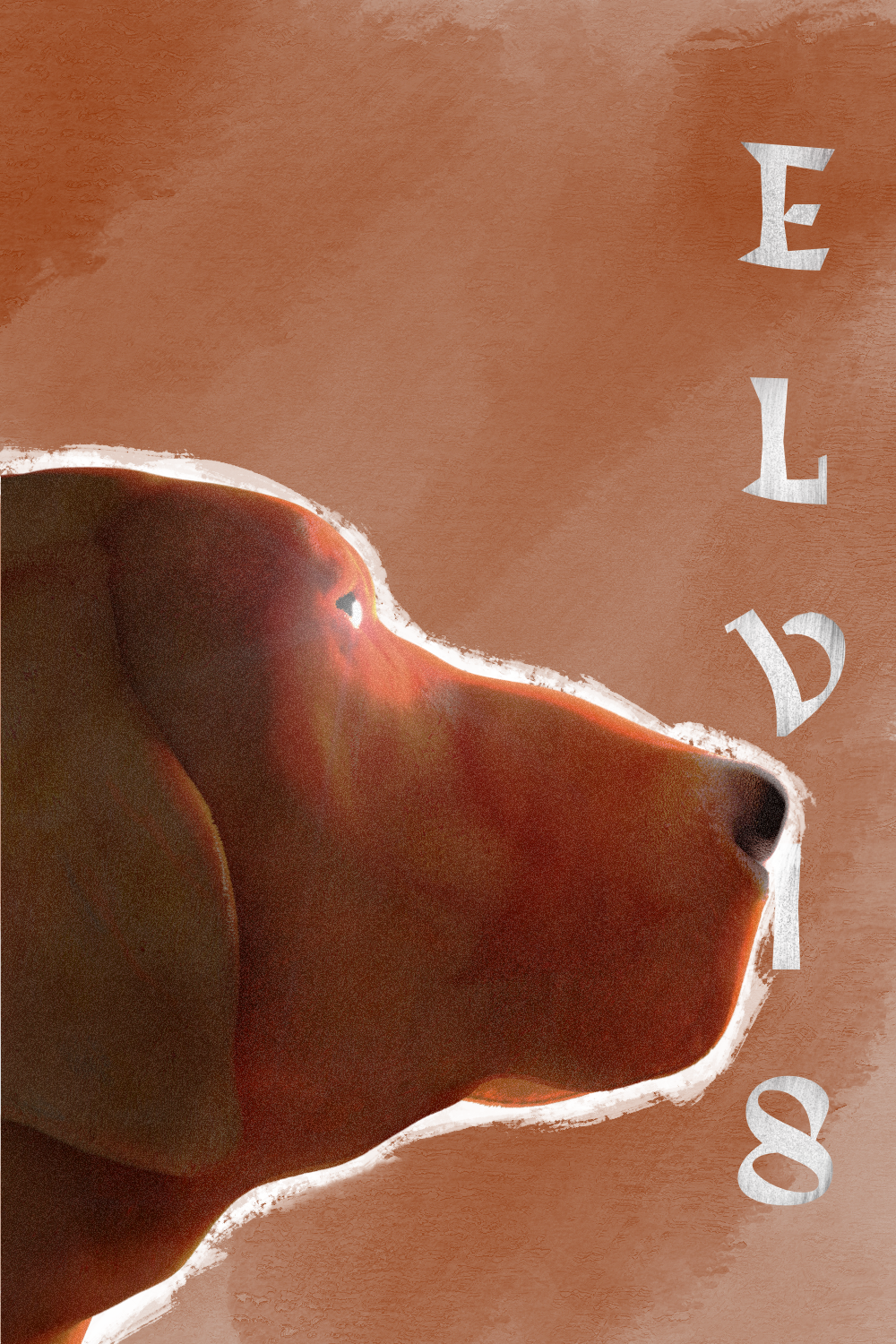
201228_02_Elvis.png
After buying an iPad Pro and not really knowing how to sculpt, I took an attempt. My parents neighbours dog (Elvis) was my muse. I sculpted him on the go and gave him some fur in Houdini.
![]()
201220_01_USA_MapPullApart.yt
The awesome Map u/tfoust10 drew with 3 lines. Simulated as it gets pulled apart like yarn.
I downloaded the map as a .jpg image and used Houdini to convert the image into 3D geometry. I then simulated the lines as a hair simulation and gave them rope/yarn like properties.
Fun Facts:
Based on this links size estimation, I calcualted the length of the lines if they were laid down in real life.
Take it with a grain of salt, it's not really an exact calculation lol
The length of all the lines combined is:
Miles: 109074.3 // Kilometers: 175537.7
Main Area:
Miles: 102146.6 // Kilometers: 164338.6
Alaska:
Miles: 6099.01 // Kilometers: 9815.38
Hawaii:
Miles 828.705 // Kilometers: 1333.67
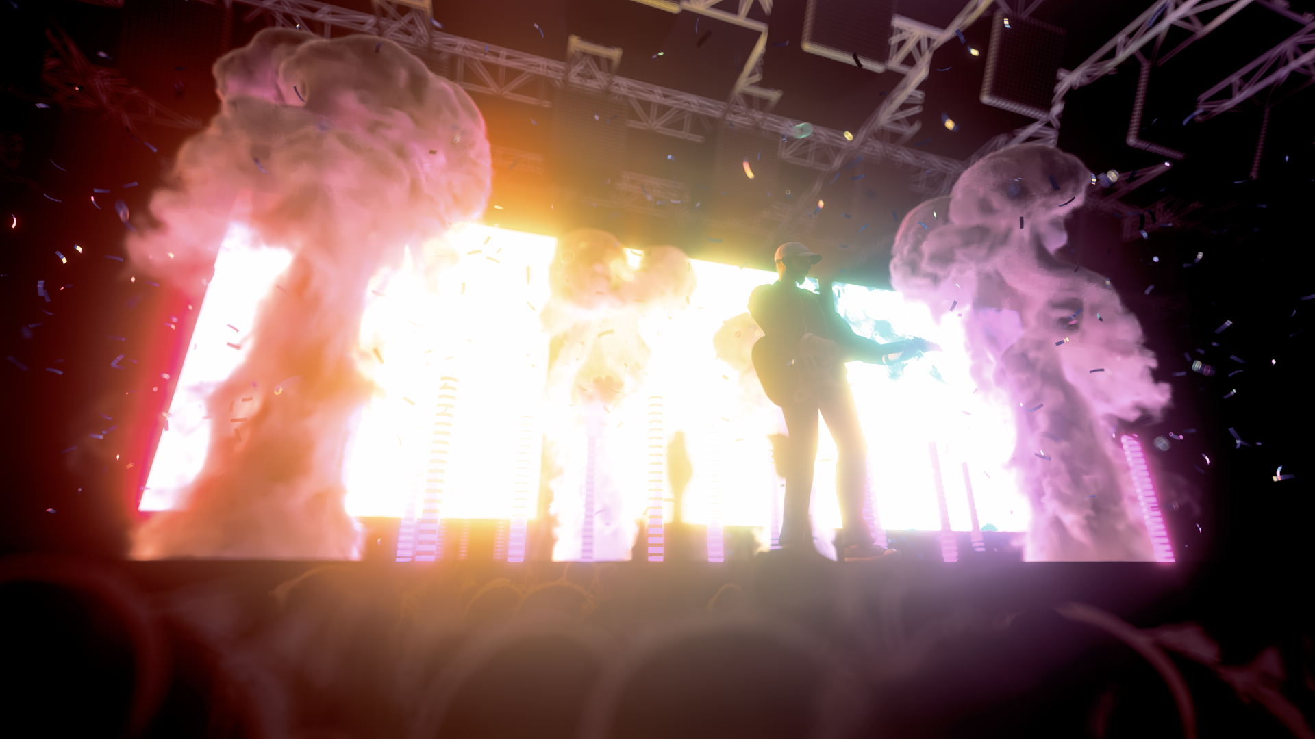
201215_01_San_Holo_Concert.png
With Covid ongoing there are no concerts. Therefore I made my own San Holo concert in 3d.
![]()
200911_01_SelfBalancingMachine.yt
Self balancing platform simulation inspired by the awesome video plzno1 uploaded.
It simulates based on the last frame evaluating the sphere's position - kind of like a PID controller.
200804_01_night_before_the_due_date.reddit
A funny section taken from my showreel.
200802_01_Game_Loading_Icon.reddit
For Aaron’s diploma movie, I had the honor to create the 3d part of everything. This is a first test for the loading icon of his fantasy game concept.
200712_01_Covid_Dataset_Germany.yt
With an ongoing pandemic it’s rather normal to see charts and data, showcasing the situation at the moment. I’ve always found it interesting to study the charts. But often I had problems putting the numbers in relation to each other. This is an attempt to create a 3d chart using the added dimension to explain proportions.
I’ve always enjoyed visualizing stuff. When I saw that the Robert Koch-Institut releases a spreadsheet each day since the start of the pandemic, I played with the thought of making a small project out of it.
Their spreadsheet isn’t very easy to understand at first glance, but it makes sense once you get into it. I set the goal to not touch the spreadsheet itself, so I could easily swap it out each day to get the current numbers.
I started sorting all the cells in Houdini and categorized them in states. To create each pile per state I split the data up in the below mentioned four categories. Using a .svg map from Germany provided by Wikipedia, I feature matched the data to the corresponding states.
First I used the data to derive the colouring from, but that turned out to be a rather irritating result. As I’ve already sorted the data to create the state height it was basically free to create the plates on top.
I also experimented with a Unreal Engine 4 implementation, but it crashed a little bit too much and I therefore put it on the back burner. But it works in general.
Next step would be to sort the date on which the information was recorded and create a over time growing chart. On a personal note: I find it very calming, that the ratio of healed to infected/dead is so high. I think Germany did a good job reacting to the virus and it’s fascinating to look at the data in depth.
![]()
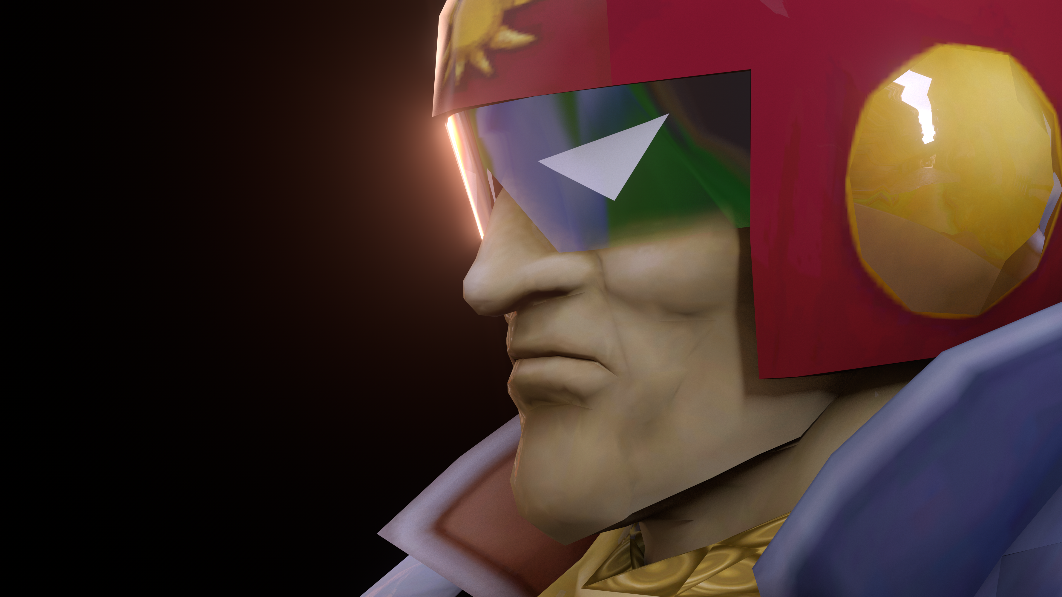
200624_01_Captain_Falcon_Close.png
This is my main in Super Smash Bros. Melee. I used the actual game model and textures to render him with redshift.
![]()
200426_01_Lego_Water.yt
The Lego movie is a personal favourite of mine. I grew up playing with them for most of my childhood. Ever since I’ve seen the movie for the first time I was amazed, how they took the world so serious. Everything is consistently made out of Legos, even the coulds and explosions. How cool is that?
Jan and I had the idea to create the same work in our respective programs. He mainly works with Cinema4D and Octane, while I’m currently enjoying Houdini and Redshift.
Both of us had a rough Idea on how to approach the project, but some problems where clear to begin with:
How could we nail the Lego look as close as possible and make everyhing feel like it could belong into the film.
We decided to record everything we were doing and only talk, once we are both finished. Check out the timelapsed documentation and more details below!
200422_01_ADC_Power_Of_No.yt
Steffen Vetterle approached us with the offer to create some shorts for the upcoming Art Directors Club Germany awards. The theme “Power of No” stood at the core of the shorts.
Saying no can be hard sometimes. You need to stand your ground when there are a lot of people who want something from you. The theme of this years ADC awards explores what it means to say no. But not in an agressive or destructive manner. More of a respective and reasonable kind.
My work tries to paint a picture on how it feels to be overwhelmed with requests. It’s not only about jobs or projects. Daily seemingly miniscule requests can often overwhem us in their sheer amount. You try to run from it but there is no escape. It’s a never ending cycle. It’s important to be able to break that cycle. Draw clear lines for what is too much and follow through with them.
200403_01_Album_Cover_Art_No_Typo.png
An album cover I made for my buddy Simon.
![]()
200329_01_Simone_Giertz_Intro.yt
Simone Giertz is a Swedish maker and inventor, showcasing her work on YouTube. She has crazy smart ideas and builds them in a fun and entertaining way. I made an Intro in her style, as a tribute for her cool projects.
Makers and inventors have an urge to create. Being a creative in general fits into the same category. I played a lot with Fischertechnik construction kits as a child. I’ve always liked to build stuff, wire some parts together to create an RC car or a simple calculator.
Simone does that to this day. She is considered the queen of shitty robots and rightfully deserves that title. All of her projects start with a stupid and fun idea and spiral into a mixture of madness and genius. “The idea” as the core of the whole creation is the basis for my intro design. Combine that with an unexpected outcome and you’ve roughly outlined her workflow.
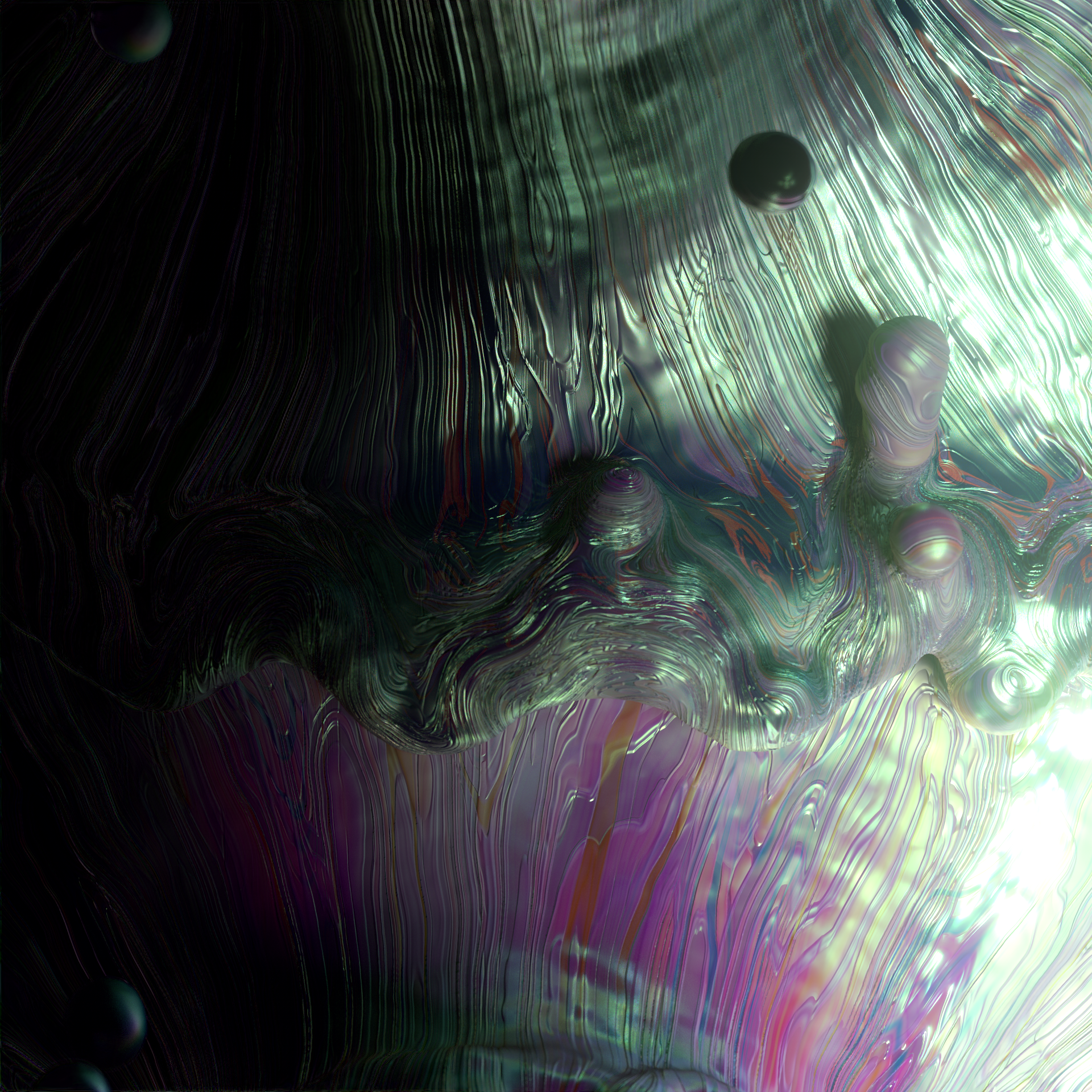
200122_01_Liquid_Tests.png
Some liquid animation and dynamic texturing tests.
![]()
200117_Facial_3D_Controller_Cubstudio_inspired.yt
Cubstudio is a cool british studio, one of the best when it comes to characters in Motion Design. From time to time they upload some rather mindblowing insights to their setups on instagram. This project is about one of those.
Joysticks and Sliders is a well known After Effects plug-in, which allows to rig and animate 2D shape layer characters in an interactive way. On Instagram Cubstudio showcased an animation test containing a seemingly 3D looking character, being driven by Joysticks and Sliders.
The comments where baffled about what kind of scorcery that is. Me included. But the idea is genuis:
Create a framework or pipeline to process 3D characters and animate them fully rendered in realtime and in After Effects. That’s flexible, fast and modular. Sure it comes at a cost. Your characters would need to be stylized in order to cover all the possible animations. But if it fits your style, moving fast and interactive sounds like a really good idea.
But using Joysticks and Sliders didn’t make sense to me. When you take the plug-in apart you can see that it relies on shape layer interpolation magic. Not on image based magic. Therefore I threw the plug-in out of the window and wrote the whole thing myself. My version isn’t based on any plug-ins or presets. I don’t excatly know what Cubstudio did to achieve this, but it looks fairly similar.
I won’t go into detail further, as they invented the technique and I simply reverse engineered it. I don’t want to spill their business secrets. Check out their original post!
Oh and the Joker head is make by my talented friend Marcel.
191215_01_Still_Life.png
Some tests of rendering a still life with some asian asthetic influence.
![]()
190917_01_DOORIS.yt
Through the reduction to the use of light, shadow and colour, the viewer experiences a new perspective on a door that opens a world previously unseen in this way.
Design as such can be subject to many rules. Nowadays it is easy to be flooded with influences and stimuli and difficult to find a concrete line or goal. So there are various approaches to design based on reducing the means used and concentrating on the core. Whether minimalism or obstruction, Marco’s, Hannes’ and my goal is always the same: finding the essence.
190909_01_Kitbash_Contest_Cyberpunk.yt
For the Cyberpunk Kitbash Contest, I took my futuristic attempt on roofing. It was a lot of fun to build and light and my GPU only burned 3 times.
190723_01_Flume_Friends_Fanmade_Album_Cover.yt
Flume makes great music. I wanted to make an animated music cover for a song, that was stuck in my head for weeks on end.
This project came along rather straight forward. I head a huge earworm of this song and I wanted to make an album cover because I liked it that much.
At the time I was rather new to Redshift and I wanted to experiment around with what can be done. Everything you see was created “in camera” in Cinema4D. Even the grain and the distortion effect.
The grain was rather straight forward in creation. I played around with sample settings and sample overrides and it resulted in a very art directable “grain machine”.
The glitch effect was created using DoF in Redshift. When you play around with the CoC and the aspect ratio of the bokeh, strange things happen. Once you push them beyond the logical limit a normal camera could achieve, you start to get rather interesting results.
190716_01_Motion_Design_Showreel.yt
Through the annual redesign of the Motion Design Branding, the class can remain at the pulse of the design world and the newly created works of the students can be showcased.
Within the framework of the branding workshop, the Motion Design course is redesigned every year. This serves to show the new works of the students, to visually update the course of studies to the latest state of the design world and to keep the appearance fresh.
During the workshop, students take on various tasks and in addition to the showreel, create a website, a booklet, merchandise and the social media presence for the study course.
In our concept the Film Academy and the Motion Design course is considered as a sports team. Similar to the Olympic team of a country, every athlete has strengths, weaknesses and own interests. The directing course differs from the camera course in terms of content. But there are also many different personalities in the study courses. Some of them work more analogue others prefer digital. In the same way everyone has different cultural and social backgrounds and different motives and interests.
The thoughts paired with the sporty, cheeky and agile appearance of sports teams have provided the perfect basis to create a dynamic, bright design. Typografie is always on the move, quickly from one place of the picture to another and the colours are challenging and competitive. In the still image, the echo effect of the Typografie makes it seem to be moving even though it is actually standing still. This is also how the initially immobile medium print looks sporty and agile. In the social media area, the concept can also be used for announcements and clips. All in all, the concept makes the course young, bright and dynamic, just like the people who study it.
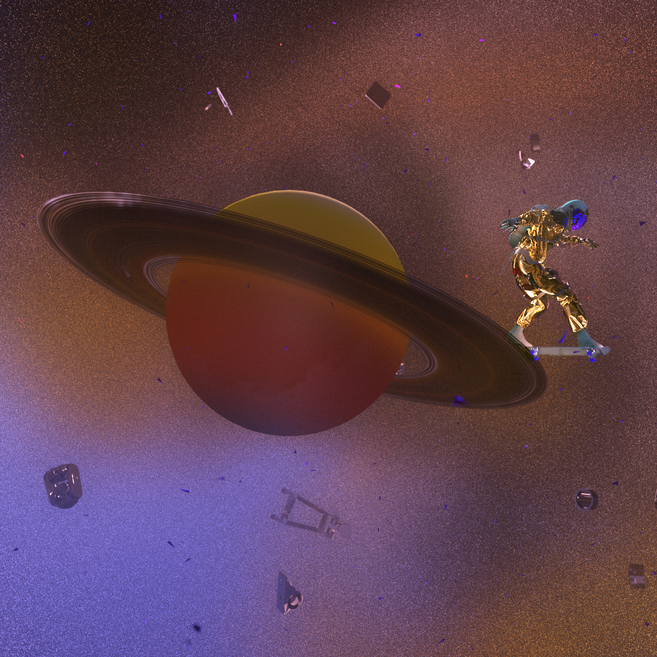
190507_02_Tailslide_Astronaut.png
Daily tests with volumetrics and rigged characters exploring the life of a lonely astronaut in space - again.
![]()
190507_01_Skull_Astronaut.png
Daily tests with volumetrics and rigged characters exploring the life of a lonely astronaut in space.
![]()
180413_01_Artheater_Cologne_Promotional_Movie.yt
In the 4. semester of my Media Design Bachelor we aquired the Artheater Köln as a client for out crossmedia project. I was tasked with the creation of the image film and the campaign language for new moving images.
The pitch was straight forward. Create a crossmedia campaign. Making print, web and video match seemed logic at first, but turned out to be a bit more tricky. First we developed a visual concept, accompanied by a message which summed up into one claim: Follow your artbeat.
Everything needed to be constantly moving, flowing and never ending. Just like a good evening at the Artheater. The core of the concept was the enjoyment of music and performance art. The dark and gritty look suited to the underground club in the heart of Ehrenfeld.
I built a binary converter, which is able to transfer normal binary numbers into artworks. Can you guess what this one says? Hint: It’s also my Logo.
210207_01_Photoscan_Tests.jpg
When I got my hands on a LIDAR scanner, surely I needed to try it out. This is my buddy Jan scanned and rendered.

201228_02_Elvis.png
After buying an iPad Pro and not really knowing how to sculpt, I took an attempt. My parents neighbours dog (Elvis) was my muse. I sculpted him on the go and gave him some fur in Houdini.
201220_01_USA_MapPullApart.yt
The awesome Map u/tfoust10 drew with 3 lines. Simulated as it gets pulled apart like yarn.
I downloaded the map as a .jpg image and used Houdini to convert the image into 3D geometry. I then simulated the lines as a hair simulation and gave them rope/yarn like properties.
Fun Facts:
Based on this links size estimation, I calcualted the length of the lines if they were laid down in real life.
Take it with a grain of salt, it's not really an exact calculation lol
The length of all the lines combined is:
Miles: 109074.3 // Kilometers: 175537.7
Main Area:
Miles: 102146.6 // Kilometers: 164338.6
Alaska:
Miles: 6099.01 // Kilometers: 9815.38
Hawaii:
Miles 828.705 // Kilometers: 1333.67
201215_01_San_Holo_Concert.png
With Covid ongoing there are no concerts. Therefore I made my own San Holo concert in 3d.
200911_01_SelfBalancingMachine.yt
Self balancing platform simulation inspired by the awesome video plzno1 uploaded.
It simulates based on the last frame evaluating the sphere's position - kind of like a PID controller.
200804_01_night_before_the_due_date.reddit
A funny section taken from my showreel.
200802_01_Game_Loading_Icon.reddit
For Aaron’s diploma movie, I had the honor to create the 3d part of everything. This is a first test for the loading icon of his fantasy game concept.
200712_01_Covid_Dataset_Germany.yt
With an ongoing pandemic it’s rather normal to see charts and data, showcasing the situation at the moment. I’ve always found it interesting to study the charts. But often I had problems putting the numbers in relation to each other. This is an attempt to create a 3d chart using the added dimension to explain proportions.
I’ve always enjoyed visualizing stuff. When I saw that the Robert Koch-Institut releases a spreadsheet each day since the start of the pandemic, I played with the thought of making a small project out of it.
Their spreadsheet isn’t very easy to understand at first glance, but it makes sense once you get into it. I set the goal to not touch the spreadsheet itself, so I could easily swap it out each day to get the current numbers.
I started sorting all the cells in Houdini and categorized them in states. To create each pile per state I split the data up in the below mentioned four categories. Using a .svg map from Germany provided by Wikipedia, I feature matched the data to the corresponding states.
First I used the data to derive the colouring from, but that turned out to be a rather irritating result. As I’ve already sorted the data to create the state height it was basically free to create the plates on top.
I also experimented with a Unreal Engine 4 implementation, but it crashed a little bit too much and I therefore put it on the back burner. But it works in general.
Next step would be to sort the date on which the information was recorded and create a over time growing chart. On a personal note: I find it very calming, that the ratio of healed to infected/dead is so high. I think Germany did a good job reacting to the virus and it’s fascinating to look at the data in depth.

200624_01_Captain_Falcon_Close.png
This is my main in Super Smash Bros. Melee. I used the actual game model and textures to render him with redshift.
200426_01_Lego_Water.yt
The Lego movie is a personal favourite of mine. I grew up playing with them for most of my childhood. Ever since I’ve seen the movie for the first time I was amazed, how they took the world so serious. Everything is consistently made out of Legos, even the coulds and explosions. How cool is that?
Jan and I had the idea to create the same work in our respective programs. He mainly works with Cinema4D and Octane, while I’m currently enjoying Houdini and Redshift.
Both of us had a rough Idea on how to approach the project, but some problems where clear to begin with:
How could we nail the Lego look as close as possible and make everyhing feel like it could belong into the film.
We decided to record everything we were doing and only talk, once we are both finished. Check out the timelapsed documentation and more details below!
200422_01_ADC_Power_Of_No.yt
Steffen Vetterle approached us with the offer to create some shorts for the upcoming Art Directors Club Germany awards. The theme “Power of No” stood at the core of the shorts.
Saying no can be hard sometimes. You need to stand your ground when there are a lot of people who want something from you. The theme of this years ADC awards explores what it means to say no. But not in an agressive or destructive manner. More of a respective and reasonable kind.
My work tries to paint a picture on how it feels to be overwhelmed with requests. It’s not only about jobs or projects. Daily seemingly miniscule requests can often overwhem us in their sheer amount. You try to run from it but there is no escape. It’s a never ending cycle. It’s important to be able to break that cycle. Draw clear lines for what is too much and follow through with them.
200403_01_Album_Cover_Art_No_Typo.png
An album cover I made for my buddy Simon.

200329_01_Simone_Giertz_Intro.yt
Simone Giertz is a Swedish maker and inventor, showcasing her work on YouTube. She has crazy smart ideas and builds them in a fun and entertaining way. I made an Intro in her style, as a tribute for her cool projects.
Makers and inventors have an urge to create. Being a creative in general fits into the same category. I played a lot with Fischertechnik construction kits as a child. I’ve always liked to build stuff, wire some parts together to create an RC car or a simple calculator.
Simone does that to this day. She is considered the queen of shitty robots and rightfully deserves that title. All of her projects start with a stupid and fun idea and spiral into a mixture of madness and genius. “The idea” as the core of the whole creation is the basis for my intro design. Combine that with an unexpected outcome and you’ve roughly outlined her workflow.
200122_01_Liquid_Tests.png
Some liquid animation and dynamic texturing tests.
200117_Facial_3D_Controller_Cubstudio_inspired.yt
Cubstudio is a cool british studio, one of the best when it comes to characters in Motion Design. From time to time they upload some rather mindblowing insights to their setups on instagram. This project is about one of those.
Joysticks and Sliders is a well known After Effects plug-in, which allows to rig and animate 2D shape layer characters in an interactive way. On Instagram Cubstudio showcased an animation test containing a seemingly 3D looking character, being driven by Joysticks and Sliders.
The comments where baffled about what kind of scorcery that is. Me included. But the idea is genuis:
Create a framework or pipeline to process 3D characters and animate them fully rendered in realtime and in After Effects. That’s flexible, fast and modular. Sure it comes at a cost. Your characters would need to be stylized in order to cover all the possible animations. But if it fits your style, moving fast and interactive sounds like a really good idea.
But using Joysticks and Sliders didn’t make sense to me. When you take the plug-in apart you can see that it relies on shape layer interpolation magic. Not on image based magic. Therefore I threw the plug-in out of the window and wrote the whole thing myself. My version isn’t based on any plug-ins or presets. I don’t excatly know what Cubstudio did to achieve this, but it looks fairly similar.
I won’t go into detail further, as they invented the technique and I simply reverse engineered it. I don’t want to spill their business secrets. Check out their original post!
Oh and the Joker head is make by my talented friend Marcel.
191215_01_Still_Life.png
Some tests of rendering a still life with some asian asthetic influence.

190917_01_DOORIS.yt
Through the reduction to the use of light, shadow and colour, the viewer experiences a new perspective on a door that opens a world previously unseen in this way.
Design as such can be subject to many rules. Nowadays it is easy to be flooded with influences and stimuli and difficult to find a concrete line or goal. So there are various approaches to design based on reducing the means used and concentrating on the core. Whether minimalism or obstruction, Marco’s, Hannes’ and my goal is always the same: finding the essence.
190909_01_Kitbash_Contest_Cyberpunk.yt
For the Cyberpunk Kitbash Contest, I took my futuristic attempt on roofing. It was a lot of fun to build and light and my GPU only burned 3 times.
190723_01_Flume_Friends_Fanmade_Album_Cover.yt
Flume makes great music. I wanted to make an animated music cover for a song, that was stuck in my head for weeks on end.
This project came along rather straight forward. I head a huge earworm of this song and I wanted to make an album cover because I liked it that much.
At the time I was rather new to Redshift and I wanted to experiment around with what can be done. Everything you see was created “in camera” in Cinema4D. Even the grain and the distortion effect.
The grain was rather straight forward in creation. I played around with sample settings and sample overrides and it resulted in a very art directable “grain machine”.
The glitch effect was created using DoF in Redshift. When you play around with the CoC and the aspect ratio of the bokeh, strange things happen. Once you push them beyond the logical limit a normal camera could achieve, you start to get rather interesting results.
190716_01_Motion_Design_Showreel.yt
Through the annual redesign of the Motion Design Branding, the class can remain at the pulse of the design world and the newly created works of the students can be showcased.
Within the framework of the branding workshop, the Motion Design course is redesigned every year. This serves to show the new works of the students, to visually update the course of studies to the latest state of the design world and to keep the appearance fresh.
During the workshop, students take on various tasks and in addition to the showreel, create a website, a booklet, merchandise and the social media presence for the study course.
In our concept the Film Academy and the Motion Design course is considered as a sports team. Similar to the Olympic team of a country, every athlete has strengths, weaknesses and own interests. The directing course differs from the camera course in terms of content. But there are also many different personalities in the study courses. Some of them work more analogue others prefer digital. In the same way everyone has different cultural and social backgrounds and different motives and interests.
The thoughts paired with the sporty, cheeky and agile appearance of sports teams have provided the perfect basis to create a dynamic, bright design. Typografie is always on the move, quickly from one place of the picture to another and the colours are challenging and competitive. In the still image, the echo effect of the Typografie makes it seem to be moving even though it is actually standing still. This is also how the initially immobile medium print looks sporty and agile. In the social media area, the concept can also be used for announcements and clips. All in all, the concept makes the course young, bright and dynamic, just like the people who study it.
190507_02_Tailslide_Astronaut.png
Daily tests with volumetrics and rigged characters exploring the life of a lonely astronaut in space - again.
190507_01_Skull_Astronaut.png
Daily tests with volumetrics and rigged characters exploring the life of a lonely astronaut in space.

180413_01_Artheater_Cologne_Promotional_Movie.yt
In the 4. semester of my Media Design Bachelor we aquired the Artheater Köln as a client for out crossmedia project. I was tasked with the creation of the image film and the campaign language for new moving images.
The pitch was straight forward. Create a crossmedia campaign. Making print, web and video match seemed logic at first, but turned out to be a bit more tricky. First we developed a visual concept, accompanied by a message which summed up into one claim: Follow your artbeat.
Everything needed to be constantly moving, flowing and never ending. Just like a good evening at the Artheater. The core of the concept was the enjoyment of music and performance art. The dark and gritty look suited to the underground club in the heart of Ehrenfeld.