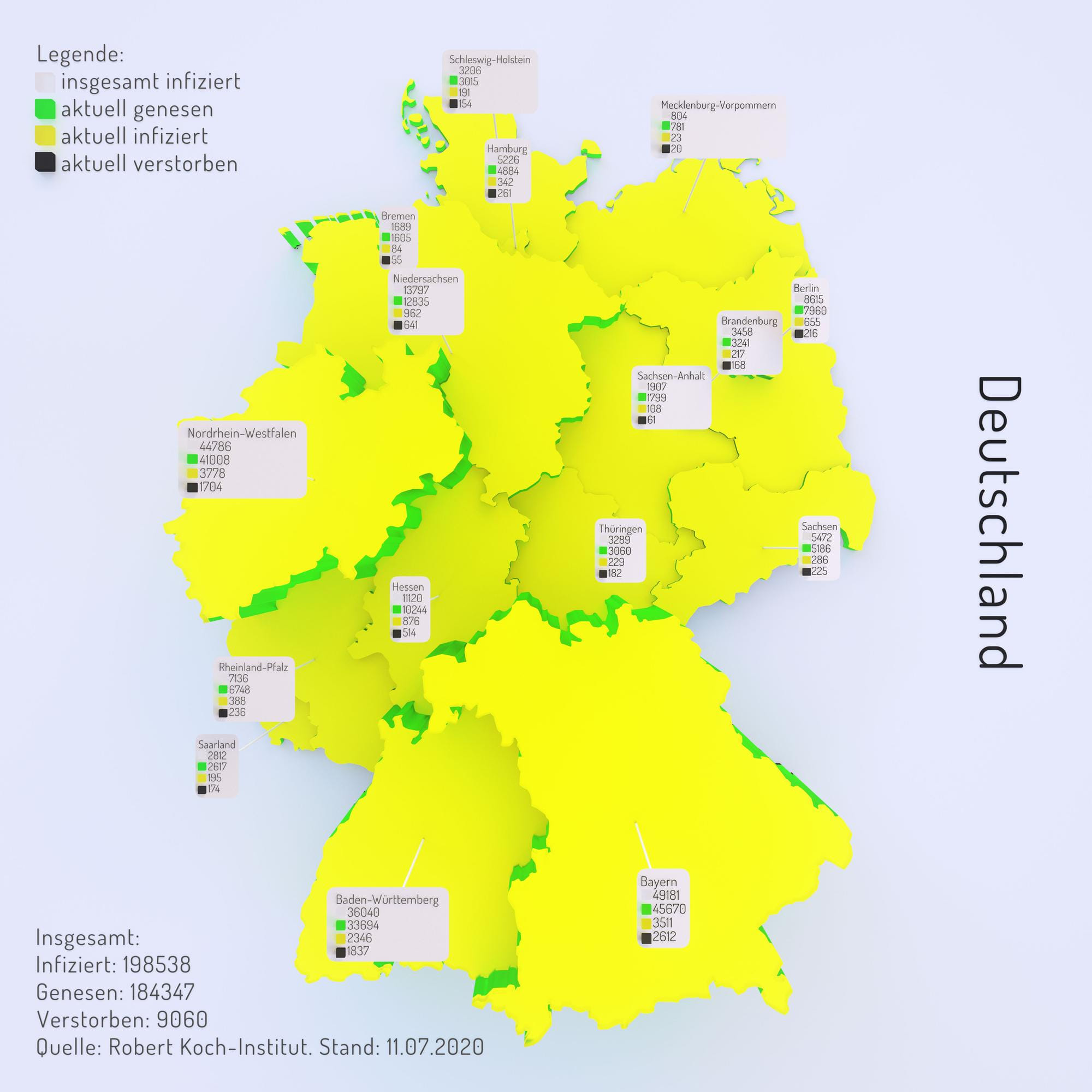
With an ongoing pandemic it’s rather normal to see charts and data, showcasing the situation at the moment. I’ve always found it interesting to study the charts. But often I had problems putting the numbers in relation to each other. This is an attempt to create a 3d chart using the added dimension to explain proportions.
I’ve always enjoyed visualizing stuff. When I saw that the Robert Koch-Institut releases a spreadsheet each day since the start of the pandemic, I played with the thought of making a small project out of it.
Their spreadsheet isn’t very easy to understand at first glance, but it makes sense once you get into it. I set the goal to not touch the spreadsheet itself, so I could easily swap it out each day to get the current numbers.
I started sorting all the cells in Houdini and categorized them in states. To create each pile per state I split the data up in the below mentioned four categories. Using a .svg map from Germany provided by Wikipedia, I feature matched the data to the corresponding states.
First I used the data to derive the colouring from, but that turned out to be a rather irritating result. As I’ve already sorted the data to create the state height it was basically free to create the plates on top.
I also experimented with a Unreal Engine 4 implementation, but it crashed a little bit too much and I therefore put it on the back burner. But it works in general.
Next step would be to sort the date on which the information was recorded and create a over time growing chart. On a personal note: I find it very calming, that the ratio of healed to infected/dead is so high. I think Germany did a good job reacting to the virus and it’s fascinating to look at the data in depth.